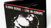
Bjørn Berge
Blackwood (Brand New Album)
Blackwood (Brand New Album)
I've photographed the amazing Bjørn Berge for his brand new album called “BLACKWOOD” (released on September 29, 2011). And in addition I proposed to design a logotype as well to suit to these photos/album.
Unfortunately the logotype has been rejected. A "classic font" was used for his new album.
Bjørn Berge is a “blues artist” (singer and guitarist). But not a classic one !
It is difficult to categorize his music only as a “blues style”, as he combines multiple musical genres. He’s an accoustic genius who delivers a really racy music, very sharp, groovy, melodic, energic, elegant.
So I made a logotype showing this complex harmony. Something different to what Bjørn has used with his LP’s/Albums covers.
The “KiloGram” font was selected to begin this project, designed by the great norwegian designer Karl Martin Sætren (KalleGraphics). This font was based on a font called “Anagram” by Nick Curtis.
“KiloGram” is a heavy display typeface, with an interesting nice retro-look but however a very elegant & modern as well. Its geometric caps are dynamic. I tried to personalized the font to fit to my perception of Bjørn & his music.
Unfortunately the logotype has been rejected.
Photo rejected.
